12 Product Design Principles
2021, 7 min read
I wanted to share what I learned in the past 2+ years working with and later at the b2b startup Laserhub
About Laserhub
Laserhub1 is a growing German startup offering custom metal parts to businesses with a modern, digital purchasing process:
Customers create their parts in CAD2, upload them to Laserhub and choose desired materials and processes. Prices are instantly calculated and upon purchase Laserhub takes care of production and logistics.
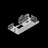
Customers range from small handicraft businesses to large corporations, which reflects their expertise and type of ordered parts (product prototypes, furniture, handrails, housing for machines, …).
The principles
Disclaimer: The following 12 principles are my own (based on what worked and what didn’t in the past) and might not reflect the company’s view.
- 1Build the right it
- 2Stay pragmatic and iterate if needed
- 3If uncertain, try it
- 4Mobile is secondary
- 5It’s okay not to touch things that are old (but working)
- 6Even professionals are not experts everywhere
- 7Don’t act on behalf of the customer
- 8Disable don’t hide (mostly)
- 9Inform about interface change
- 10Design with high contrast
- 11Layout that accommodates more text
- 12Where possible, work with data
- 1
Build the right it
Doing one thing means not doing another thing. Resources in a startup are limited (even if millions in funding sounds a lot) so saying Yes to the right things is crucial.
“Build the right it” by Alberto Savoia 3 has been highly influentual to us.
- 2
Stay pragmatic and iterate if needed
This works in tandem with (1) because we want to “build the right it” as well as “build it right”. Even if tempting we don’t have the resources to make everything perfect immediately. We commonly evaluate what the minimum4 is that provides value and ship that.
It might sometimes feel like shipping unfinished things, but the difference is that it’s a conscious decision. Often the small solutions already fixed our customer’s issues.
This is especially true since the quality of B2B services still lags behind the quality we are accustomed to from the B2C sector. If we notice however that a solution is not complete we improve on the feature later.
- 3
If uncertain, try it
One of the upsides of the startup/agile approach is we can ship something and if it goes awry we either revert the changes or ship an update quickly. You can’t always predict how a change is gonna affect the system (conversion rate, sales, customers support tickets, etc.), but we can ship and monitor closely the effects.
Example: As part of the purchase flow you have to upload what is called a “technical drawing” which thoroughly specifies a part’s production. Due to various reasons we had to alter how this worked. We did successful user testing of the new flow, but that’s a tiny sample size compared to all customers. Instead of doing additional (and time consuming) research or interviews we shipped the feature and watched the numbers. It turned out, our worries were superfluous.
Note: A/B testing would have been a valid approach too, but is resource intensive. And might not be possible if you don’t have the necessary traffic5.
- 4
Mobile is secondary
Our customers mainly order from their desktop computers at work. This results in a mobile usage inside the app which is much lower than the web’s average. We make mobile work but are cautious on the time spent on it (again “(1) Build the right it”).
However certain areas like Account management or Past orders might become important use cases in the future (e.g. business man or woman on the go) where it’s worth investing time into.
- 5
It’s okay not to touch things that are old (but working)
Many areas of the system haven’t changed much in the many months, e.g. login, past orders, saved quotes. They might not be perfect but for our customers they work well. In the end we want to work on things that create a positive impact on our customers.
Example: I personally don’t like the icons from FontAwesome6 … the style is too cartoony … but replacing them is time consuming and will have 0 impact on our customers. Thus we keep them and it’s fine.
- 6
Even professionals are not experts everywhere
In the past we thought: We have professional customers that know exactly what they are doing → We explain only the things that they can’t know. Example: We don’t explain what an “inspection report” is but only which type we offer because it’s a common industry term.
→ This has been proven to be not true many times:* You might be a great engineer with many years of experience but it can still be your first time designing metal tube parts.
We have to find a balance because it’s impossible to explain everything – a reasonable approach might be: Explain the minimum possible in a tooltip, and link out to an article/video for a more general explanation.
- 7
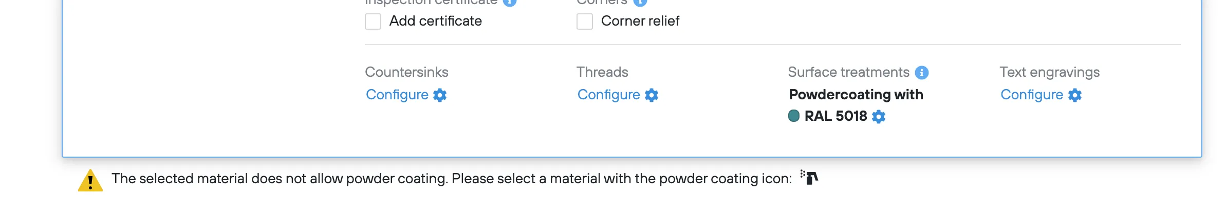
Don’t act on behalf of the customer
This one is a bit Laserhub specific since an important part of the platform is “The Configuration” where customers specify how their parts should be produced:
It’s possible for the customer to configure a part that is not manufacturable. We give the reason why this is the case but don’t automatically fix the “error” for the customer.
Why? Often there are multiple ways to resolve it and it depends on the customer’s needs which option should be chosen.
Example: Selecting powder-coating (a color finish) with a material that can’t be powder-coated (due to its material properties). Here we tell the customer what to do to get a powder-coated part:
- 8
Disable don’t hide (mostly)
Related to “(7) Don’t act on behalf of the customer”. We don’t hide unavailable options, we disable options them and explain why they’re not available. This educates customer about what is (not) possible and due to which reasons and also shows our full offering which can be important for the customer’s future considerations.
Example: Material is not available for bent parts
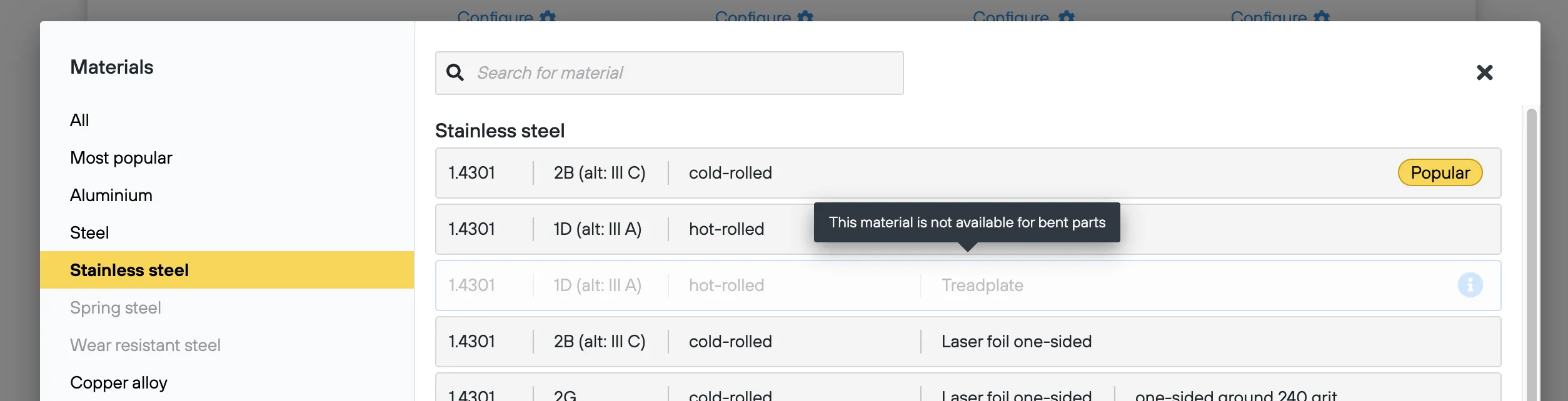
Sometimes we consciously violate this principle: E.g. the option “relief cuts” is only shown for bent parts because a flat part can never have an issue that is solved by relief cut.
- 9
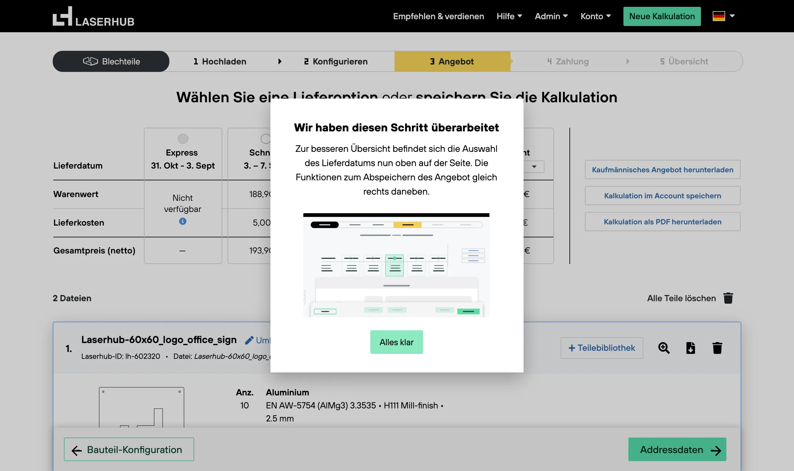
Inform about interface change
Big changes are often necessary, but to users they can be frustrating (especially complete redesigns). They might interrupt you in a moment where you wanted to get a task done. You know how to get it done in the current interface, which makes the changes annoying even though the new solution might be better. As in our web-app we can’t let you decide whether to update, but we at least make it as pleasant as possible and explain what changed.
Example: When we redesigned the offer screen, we showed this popup with a gif of how the interface changed.
- 10
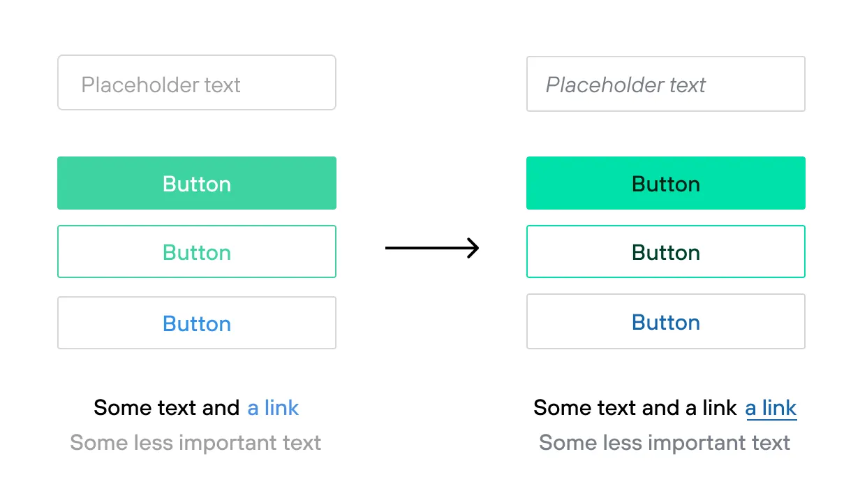
Design with high contrast
Many of our customers are more senior (as is their hardware) but it should be a pleasant experience nevertheless.
I go with the rule: The interface should be readable on the beach ☀️ 🌴 💻 🕶️ (I made a small page of dos and don’ts7)
A before and after example of some of our interface elements:
- 11
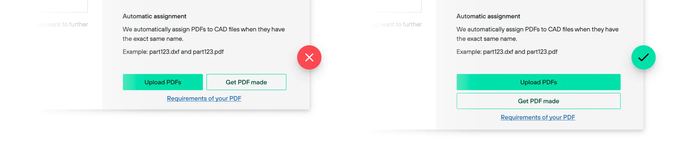
Layout that accommodates more text
It didn’t happen only once to us: Text length varies a lot between languages (especially French is often longer than the others) and can break the interface. If an interface works nicely because the words just fit … don’t go with that solution.
- 12
Where possible, work with data
Data can be really helpful to challenge your assumptions. How frequent do customers use the system? How many parts do they commonly configure? Which file formats do they prefer? Business intelligence tools such as Mode8 (which is what we used) make this possible, quick and easy.
Conclusion
It was fun reflecting on the implicit rules that we at Laserhub somehow follow. Some might be pretty specific to Laserhub’s challenges, but I hope you find these helpful nonetheless.
- 1Laserhub homepage↗ (in German) ⤴
- 2CAD stands for Computer-aided design and is the common way today to design parts to be manufactured ⤴
- 3“Build the right it”↗ by Alberto Savoia on Youtube ⤴
- 4In the startup world you often hear the term MVP which stands for Minimum Viable Product. The idea is to create the most bare version that still provides value to customers. ⤴
- 5A/B Test Sample Size Calculator↗ by Optimizely ⤴
- 6The icon library we are using is called FontAwesome↗ ⤴
- 7UI design accessibility (common pitfalls and their solutions) ... unfortunately temporarily offline ⤴
- 8