Laserhub's shared language between dev and design
About
“When you don’t need a fully-fledged design system but still want to get rid of inconsistencies”
Issue
Many different font sizes, dozen shades of grey, messy line heights, colors that look similar but are not the same … the usual problems once an application grows in complexity.
For us this resulted in a bumpy handoff process and inconsistent design itself.
We wanted to tackle this issue the Laserhub way: Staying pragmatic. We want to solve these issues but without a full-blown design system, which likely would just have slowed us down.
Most flaw-inducing areas were:
- Typography
- Colors
- Spacings
- Shadows
- Common UI components
Website vs. App:
This content mainly relates to the app (app.laserhub.com) and not our website (laserhub.com) – we try to be consistent, but the challenges and requirements are different.
Preface
Our solution is basically a “best of” of Material Design and TailwindCSS which we have adjusted to our needs.
However, also worth looking at are the design systems from Shopify (“Polaris”), Atlassian and HelpScout.
Special thanks to Lukas Hermann who helped out tremendously, but also the rest of the team for welcoming this change and giving their opinions.
Content
Font
Base font size
For the base font size, we looked at other web-based SaaS software (Dropbox, GitLab, GitHub, Slack, Google Calendar) since they have similarly complex interfaces. 14px seems to be a suitable choice as base font size. It’s a good trade off between required space and readability.
Why is text-md ≠ 1rem?
We thought about setting 1rem to 14px as it’s our base font size, but since 14 doesn’t divide nicely we stuck with 16px.
Type scale
Our type scale starts at 10px and goes all the way up to 64px. We try to avoid everything below 14px though.
By default all styles have a line height of 125% (rounded to the next px value). We don’t use all styles of our type scale but it’s good to be prepared.
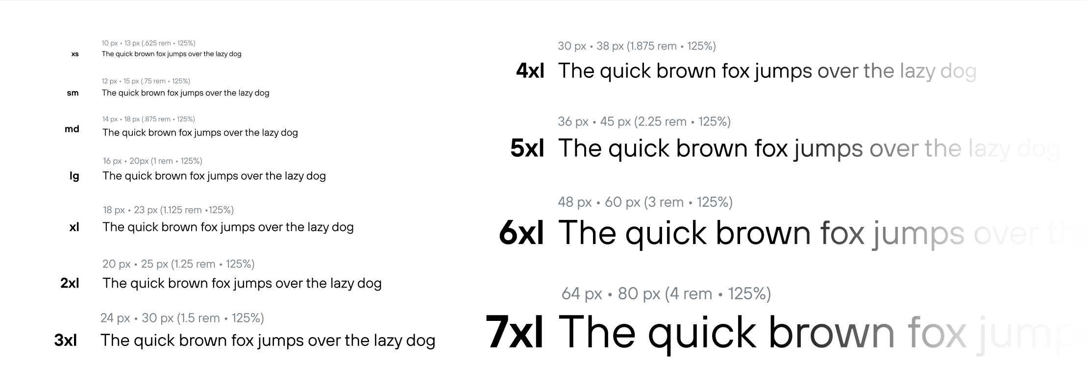
Developers can use utility classes like text-md or text-4xl and everything is as it should be.
User defined sizes:
Since it is based on a system it wouldn’t be too hard to have font-size settings for customers some time in the future.
Bootstrap (which we are using via bootstrap-vue) has text size coupled with semantics. E.g. an H1 has a larger font size than an H2. This can be quite limiting, so we decoupled that: <h1 class="text-4xl"></h1> can be used on one screen and <h1 class="text-2xl"></h1> on another if needed.
Not really relevant for design since we don’t think much in terms of H1/H2/etc. but I thought it’s interesting to mention.
Weights
Out of the 18 cuts that our font provides we use the 6 cuts that work nicely on (not hi-dpi) screens. The other cuts are sometimes cool to use for marketing material, e.g. the thin one in large sizes.

About our “fake” bold: Our font TT Hoves is georgeous but its heavier cuts run quite narrow. So we relabelled demibold as bold in Figma and code. That makes it easier to work with, since you can use the <b> and <strong> tags naturally.
Font conclusion
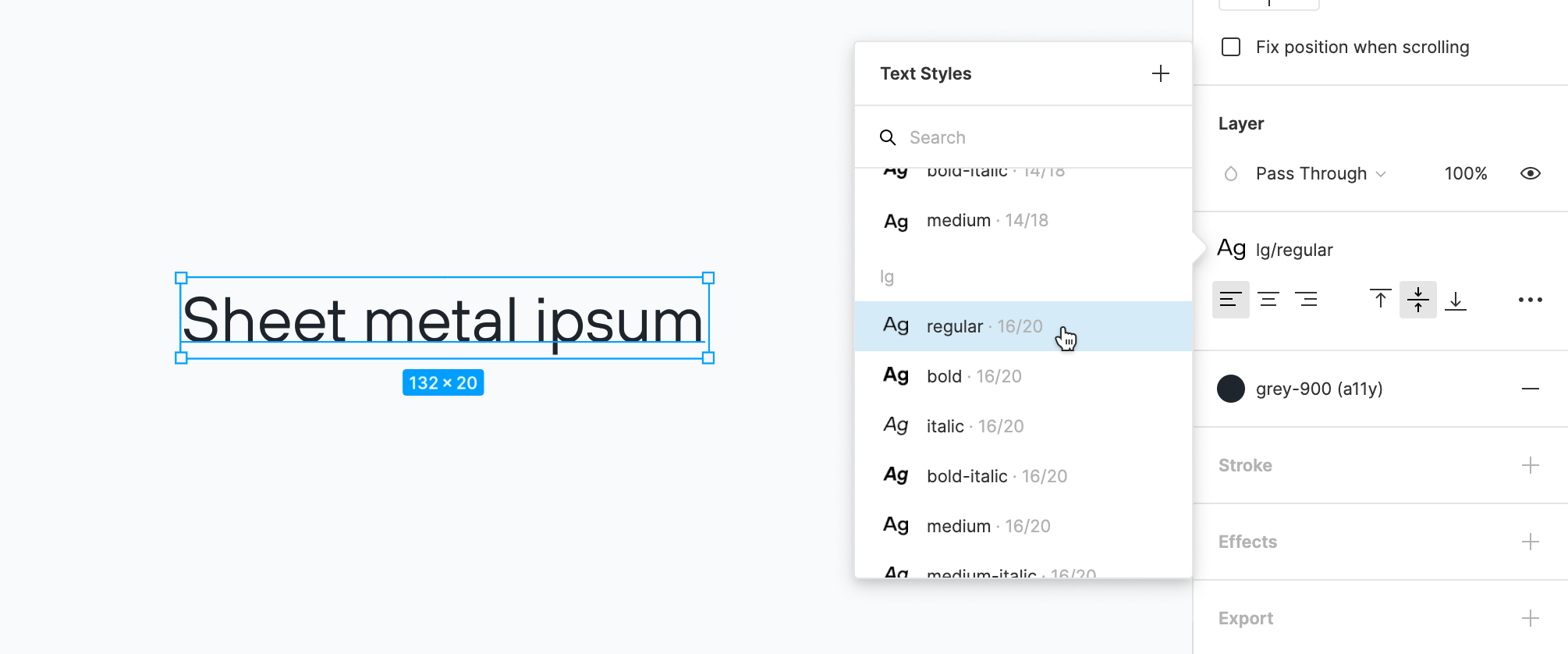
All this setup means I don’t set font sizes anymore but just pick them in Figma (the only exception being a custom line heights every now and then) and software engineers don’t do any hardcoding anymore 👍
Colors

Nothing too special here: We have 9 shades of each common color alongside regular black and white. Yellow and green (we call it mint) are our brand colors.
The greys are saturated – a steel-like blue taint – to be more interesting to the eye.
Other color systems: Only black and mint-500 have CMYK counterparts since we do little printing where color accuracy matters, but this might change in the future.
Every color transfers into code as SCSS variables like $mint-500 or $yellow–200, but also as utility classes like text-gray-600 or bg-gray-600 (again, not relevant for design but maybe worth mentioning).
Yellow acts as a highlight color and mint is used for call to actions. All colors obviously double for the usual color coding green = success, blue = info, etc..
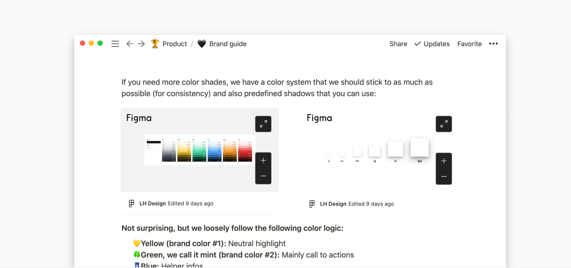
The Figma page about colors is also embedded into Notion where our brand guide lives, so that it’s accessible to the whole company:
A note on accessibility: In Figma I also added a11y to all colors which – on a white background – are AA compliant. This just makes it harder to pick the wrong color :)

Spacings
Previously we only used Bootstrap’s spacings or fell back on hard coding. To be able to use them exclusively we added a bunch of new ones:

I don’t really spec much, because the devs have a good eye for picking the correct size. If a screen should really be precise, it’s handy since it avoids back and fourth.
When to use which notation system?
1/2/3 vs. 400/500/600 vs. sm/md/lg
sm/md/lg:
When you are sure you won’t need any sizes in between and there is clear default (e.g. for font or shadow sizes)
1/2/3:
Similar to the previous but when there is no clear default (e.g. for spacings)
400/500/600:
For a capped range of things (e.g. for colors or like the web’s standard for font weights) → We can easily add shades in between like a super light grey-50
Shadows

Straight forward as well. Worth mentioning is that I opted for less subtle shadows since our customer group is a bit older; as is the hardware they are using.
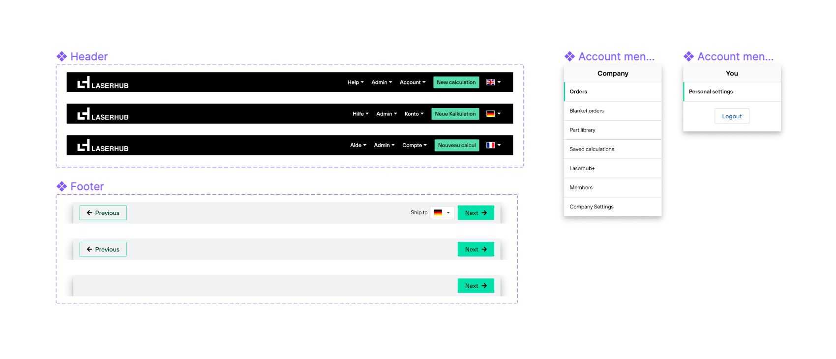
Common UI elements
Frequently used components
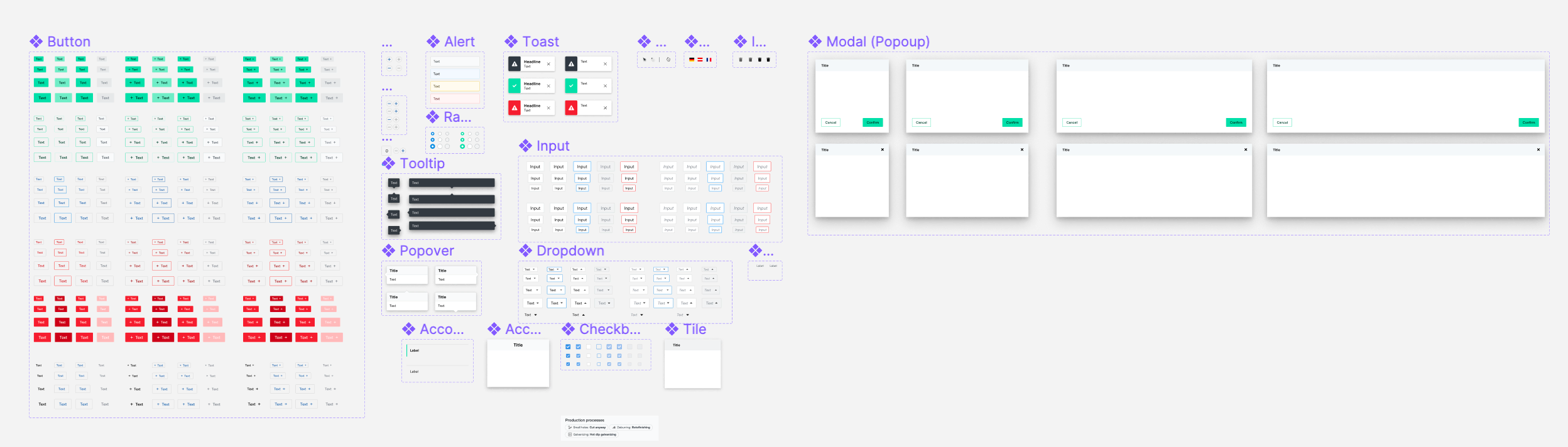
Our component set is heavily influenced by our usage of Bootstrap. Over time we customized many of the components and added new ones, but aspects like having all components in many sizes and a somewhat “bootstrappy” style is prevalent.
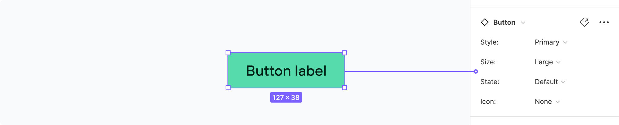
I added to Figma the ones we most commonly use – buttons, dropdown, popups, etc. They are set up as variants. Naming in Figma is also in sync with Bootstrap which makes the handoff smoother:
Icons
Font Awesome is our icon set and the icons we actually use are inside Figma as well. Since in code we import them through a library their naming is in line with Font Awesome.
We also have custom icons where needed which match Font Awesome’s style.
Naming tip:
In braces I added alternative names for the icon, which makes them show up in Figma’s search no matter how you search for it.
Other components
We have other components in Figma, but those are mainly to speed up the design process. Especially bigger components (e.g. part configuration) are not (yet) in sync between design and code.
Conclusion
We found this balance between a strictly defined design system and total freedom really fun and fast to work with.
It assures consistency without being too restrictive.
I can recommend really recommend it, if your design team consists of one or only a few people.
Your thoughts?